
"Make me a landing page for a coffee brand." You toss that off, look at what comes back, and sigh. The type is flat, the palette looks like a template you've seen a hundred times. A lot of people hit this exact wall with AI design tools, and what separates a great result from a forgettable one usually isn't taste — it's which model you're running and how you brief it.
Here's why the same prompt produces wildly different work, and how to choose for the job in front of you. Everything below reflects where things stand as of July 2026.
- Every model trades off along an intelligence / speed / cost triangle, so reaching for the top tier isn't automatically the right call.
- Design quality hinges on prompt structure at least as much as on model tier.
- Latin typography and scroll interactions are better than you'd expect; non-Latin scripts and dense layouts still need a human hand.
Same prompt, wildly different mockups — what gives?
The first time it happens it's genuinely confusing. Yesterday's output looked like agency work; today's looks like a sophomore class project. Before you start second-guessing your prompt, check which model is actually running under the hood.
Modern AI models ship as families, not single products. Under one brand name you'll find several siblings from the same generation with very different performance profiles and price tags, quietly splitting the workload between them.
When a tool silently routes you to the cheap sibling, you get flat results and no explanation why. Figure out whether the problem is the pan or the burner before you blame the recipe.
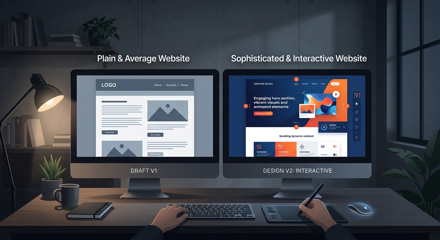
Think of a model lineup as a team you're staffing
I find it easiest to map model tiers onto roles at a company. Framed that way, the choice gets obvious fast.
At the top sits your ace. It handles text, images, audio, and code together, and it absorbs messy, ambiguous briefs without falling apart. The catch is the salary — token costs add up quickly.
Below that is the value tier, the all-rounder who handles most day-to-day production work just fine. The lightweight tier is your junior hire: built for speed, ideal for real-time and mobile workloads.
| Tier | Strength | Cost | Best for |
|---|---|---|---|
| Top (the ace) | Complex layouts, polish | High | Final deliverables, portfolio pieces |
| Value (all-rounder) | Balanced quality | Medium | Most everyday production |
| Lightweight (junior) | Speed, real-time | Low | Drafts, repetitive passes, mobile |
The point is that you don't need to page the ace every single time. Bang out ten quick drafts on the lightweight tier, then polish only the winner with the top model. Compared to running all ten through the ace, nearly all of the cost drops out of the front end. Your invoice notices before you do.
Why "just use the smartest model" is bad advice
Benchmark leaderboards are seductive — the top model posts the highest scores, so of course you reach for it. But there's a trap waiting in real production work: the smarter the model, the slower and more expensive it is.
Within a single generation, the intelligence gap between tiers is often barely perceptible in practice, while the price gap can be several times over. If you need to crank out dozens of mockups in an afternoon, a model that takes a few extra seconds per render and costs double is not your answer. Now that we're all effectively hiring AI as staff, the metric that matters is value per dollar.
Is the "big leap in design ability" actually noticeable?
Every model in this category lately claims its design skills have improved dramatically. I filed that under marketing copy and moved on — until I started digging into the examples people were passing around. Something really has shifted.
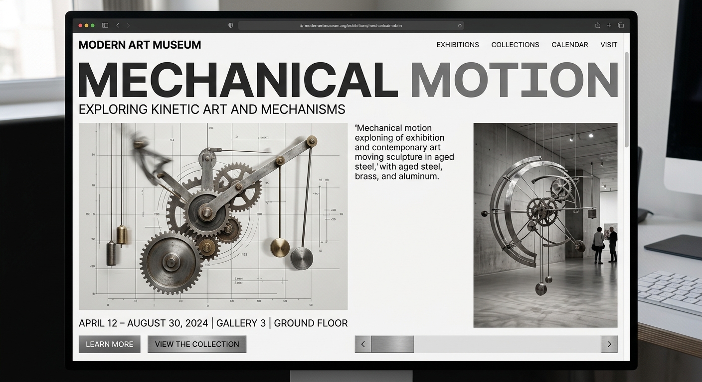
The showcase example is a museum exhibition site built around kinetic art. The brief was full of abstract asks: "extend the physical exhibition into a digital experience," "scroll-driven interactions that echo mechanical rhythm," "restrained art direction." The output read those nuances surprisingly well — not just sensible section structure, but passages where elements turn like interlocking gears as you scroll.
If you tried the first wave of AI mockup tools two or three years ago, the difference will feel like whiplash. Back then it couldn't reliably align a row of buttons. Now it's translating a vague word like "mood" into an actual layout.
Latin type comes out beautifully. Everything else, less so.
My favorite stress test for a model's typographic instincts: ask it to build an entire website about a single typeface, with no images allowed. Strip out the photography and you see exactly how much design it can do with text alone.
Hand it Helvetica and the results are genuinely fun. It'll lay out a timeline of the face's history since its 1957 debut in Switzerland, curate the brands that made it famous, and add interactions that let you push letter-spacing and weight around to feel how the face behaves. That cool, clinical Swiss grid quality survives the trip.
Non-Latin scripts are where it wobbles. Run the same brief in Korean, Japanese, or Chinese and the composure evaporates. Hangul, for instance, has a thriving modern type scene, but its character widths and stroke contrast behave nothing like Latin letterforms, so they don't drop cleanly onto a Western grid. That gap is still a human's job.
So I lock down four things in every prompt
Vague in, vague out. Ask for a coffee brand site with a one-line "build me a site" and nine times out of ten you'll get wallpaper. Nailing down at least these four consistently lifts the output a full grade.
- Subject and tone: pin the mood with adjectives — "mid-century modern, restrained"
- Structure: specify how many sections and in what order, as numbers
- Interaction: call out the motion explicitly — "a scroll-reactive section here"
- Constraints: say what not to do — "keep copy short, lead with imagery"
Illustrations, games, interactive demos — how far does this go?
These models don't stop at websites anymore. Ask for a nine-section presentation and you'll get a genuinely handsome image-led deck; ask for a simple playable 3D game and it'll produce one. The games are a coin flip on stability, though — sometimes the page freezes the moment it loads.
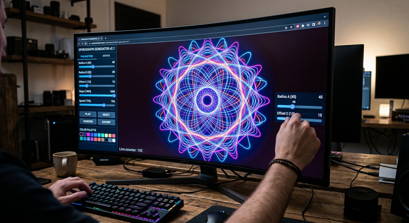
The application I've found most useful is interactive visualization of math and physics concepts. How a spirograph traces its curves, how two waves interfere to create a pattern — it turns those into hands-on worksheets you can actually manipulate.
Building one of these used to mean hand-porting trigonometry into code yourself. Now "build me this" gets you a working interaction with the formulas already baked in. If you work in educational content or on the visual layer of a brand site, this is the real leap.
So what should you be running right now?
One question decides it. Is this task volume work or finishing work? Draft fast on the lightweight or value tier; save the top model for the final pass. That distinction will do more for you than hunting down whoever currently sits at number one on a benchmark.
If you try one thing today, make it this: pick a typeface you love and have your tool build a whole site about it. Look at the typography and the whitespace in what comes back. Within five minutes you'll know whether you're working with the ace or the junior.
The better these tools get, the more sharply defined the human role becomes — not smaller. The speed only belongs to the people who know what to ask for.